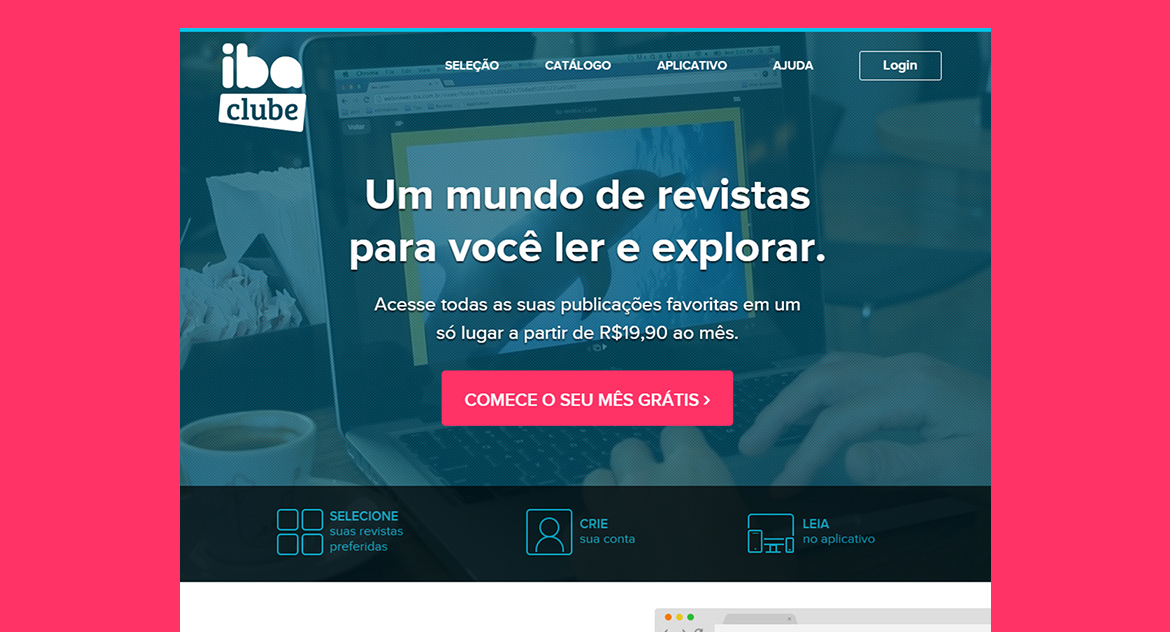
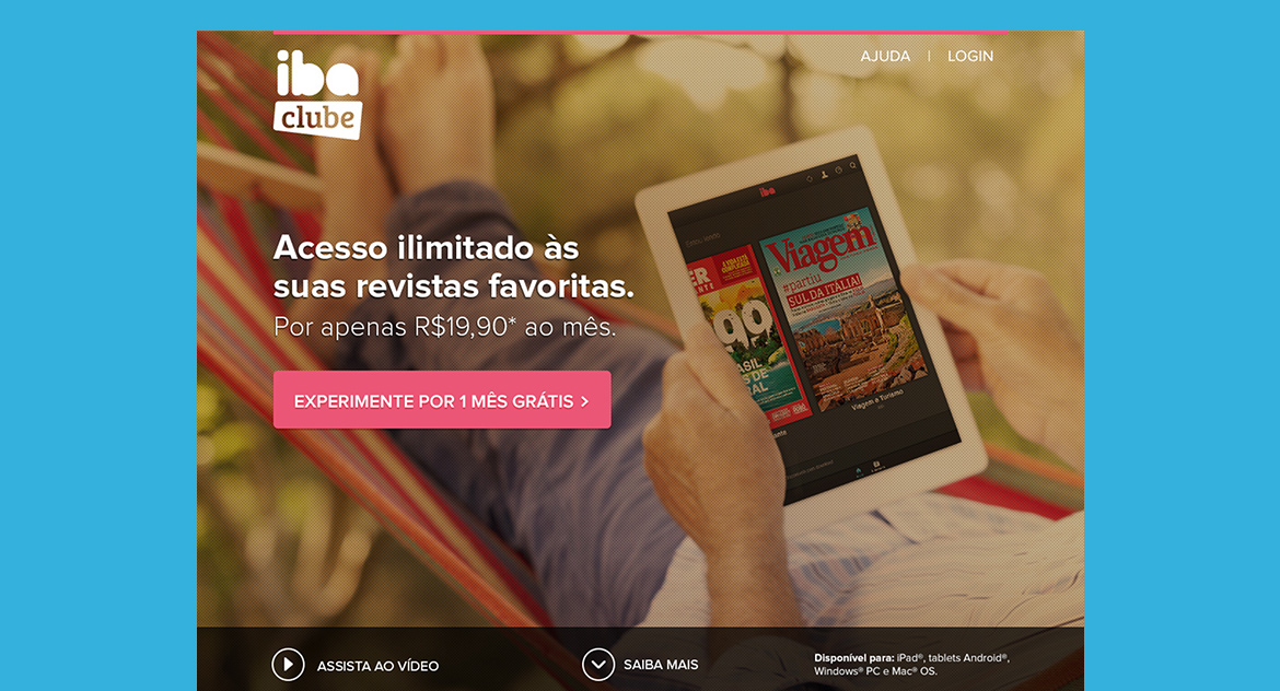
Overview
iba clube was a digital magazine subscription service, born as a separate product within the iba ecosystem and later becoming the core offering after the e-commerce platform was discontinued. As the second chapter of a brand journey I had been part of since the beginning, I took on the role of design team lead, responsible for evolving the iba brand into a distinct identity for the clube. Having worked on iba from the start gave me a strong foundation to make intentional creative decisions, maintaining the brand’s DNA while building something new.
The challenge
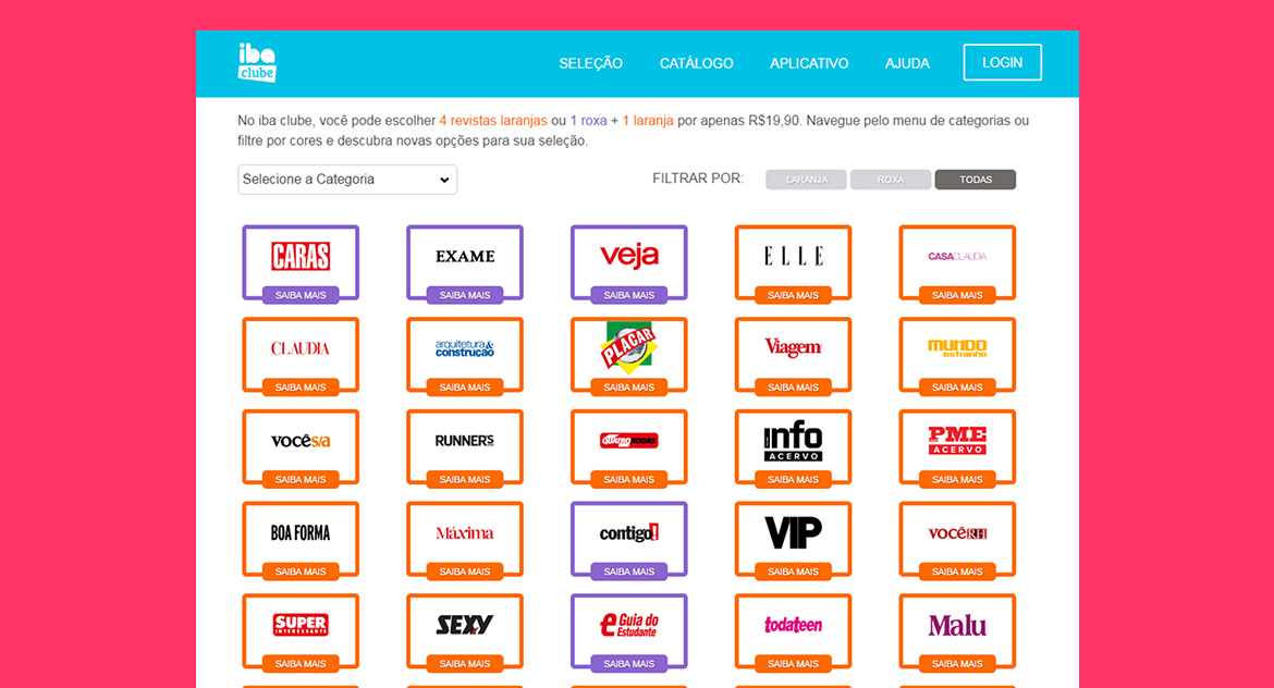
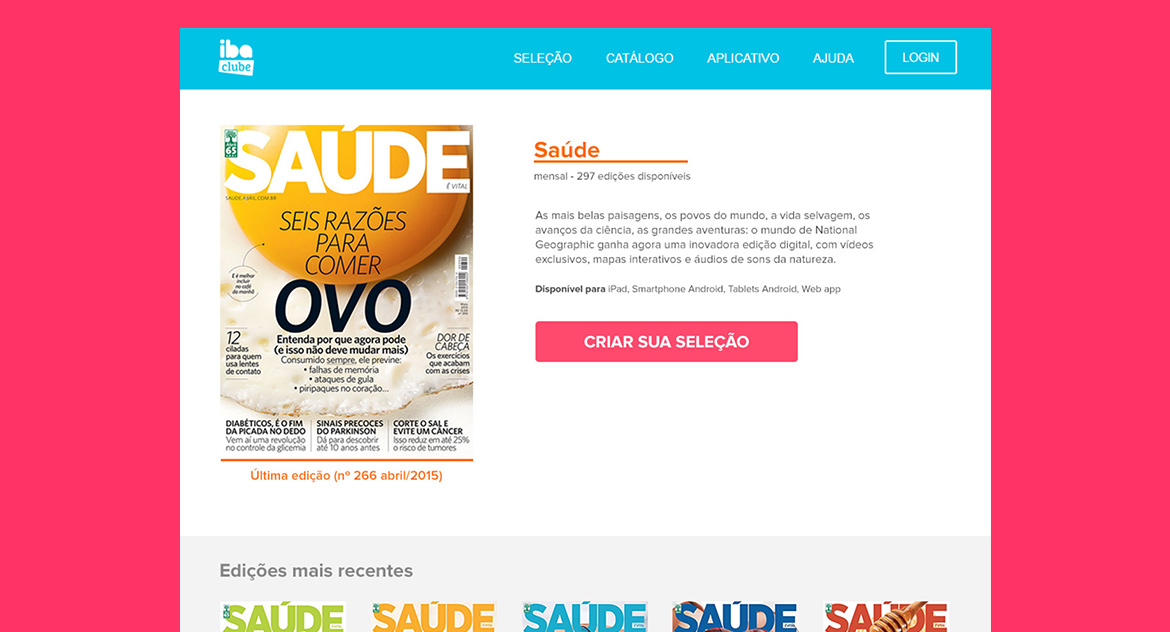
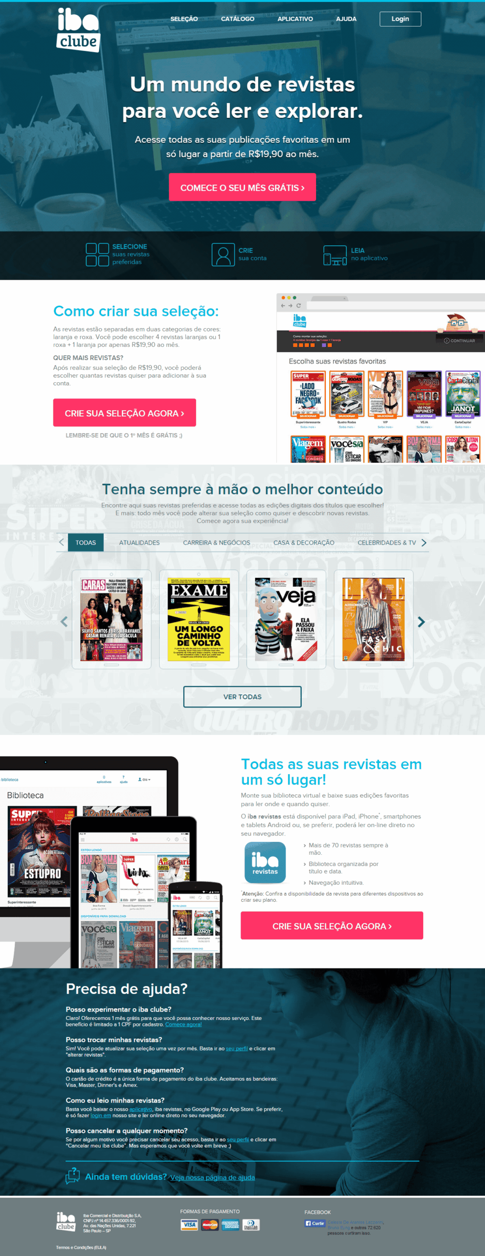
One of the central design problems was how to communicate the subscription tiers clearly without using generic terms like “normal” and “premium” or frequency-based labels like “weekly” and “biweekly,” which didn’t accurately reflect what each plan offered. The naming needed to be intuitive, neutral, and visually distinct.
My solution
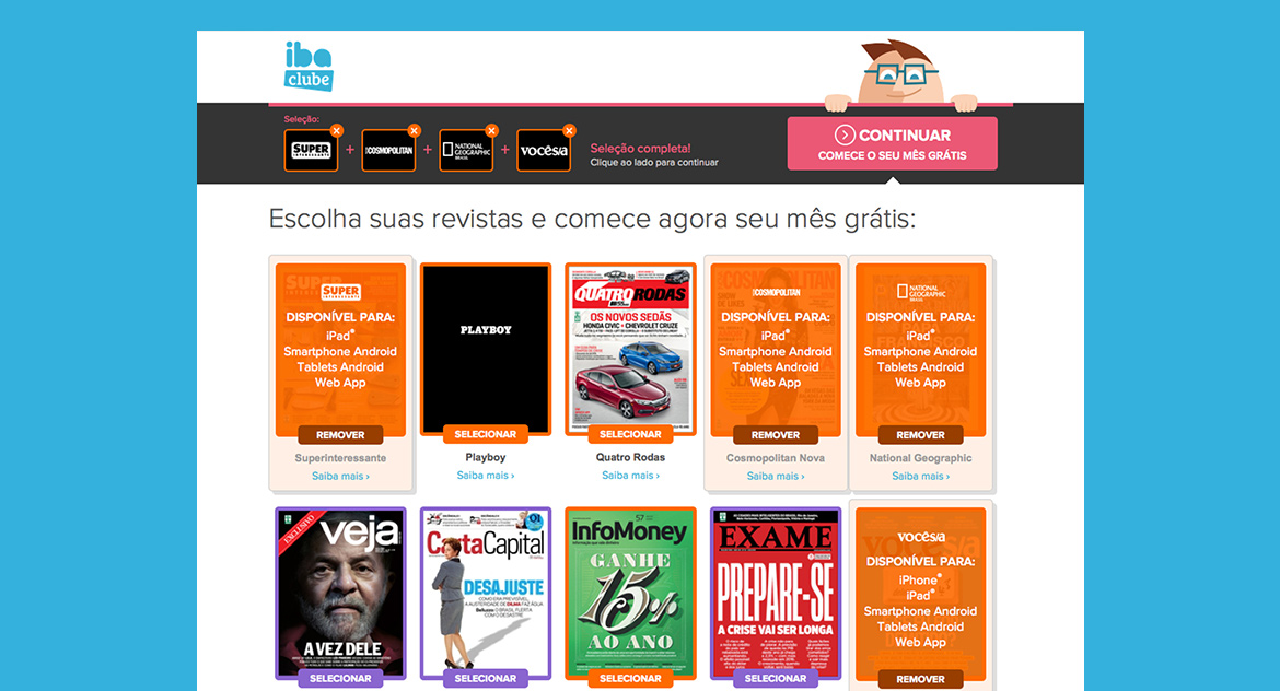
I developed a color-based categorization system to differentiate the magazine tiers. Titles were divided into two groups: Orange and Purple. Subscribers could build their own plan by choosing either four Orange titles, or a combination of one Purple and one Orange title. The color coding made the tiers immediately recognizable across the interface, marketing materials, and communications, without relying on value-loaded language.
My role
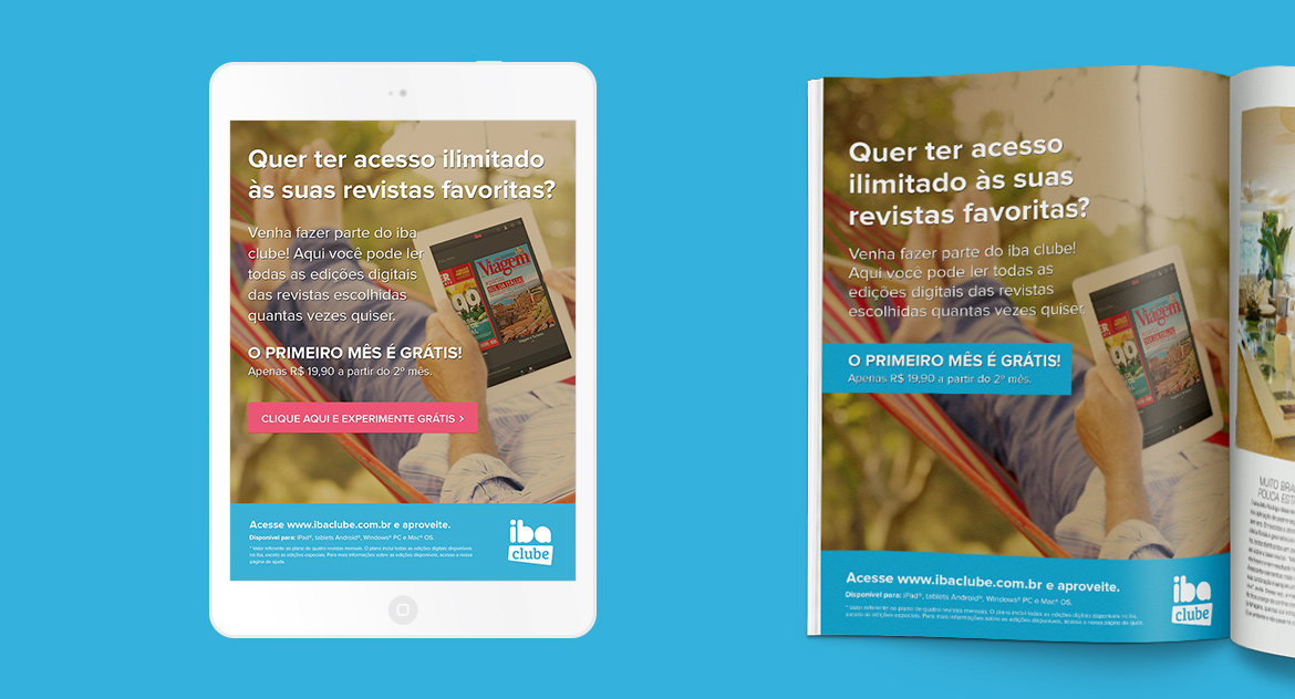
Leading a small design team, I oversaw the visual identity evolution from iba to iba clube, developed brand guidelines, and created responsive website designs, mobile interfaces, and promotional materials. I collaborated closely with developers, product, and marketing teams to ensure design decisions translated effectively across the product and its communications.
Deliverables
- Brand identity evolution and guidelines
- Responsive website design
- Mobile interface design
- Promotional and marketing materials
- Color-based subscription tier system